Review cards & Google profiles · Ponca City, OKLive site · Client
AW Marketing
A nine-page site for a Ponca City review-card and Google-profile service, with a contact form that saves every inquiry before emailing it.
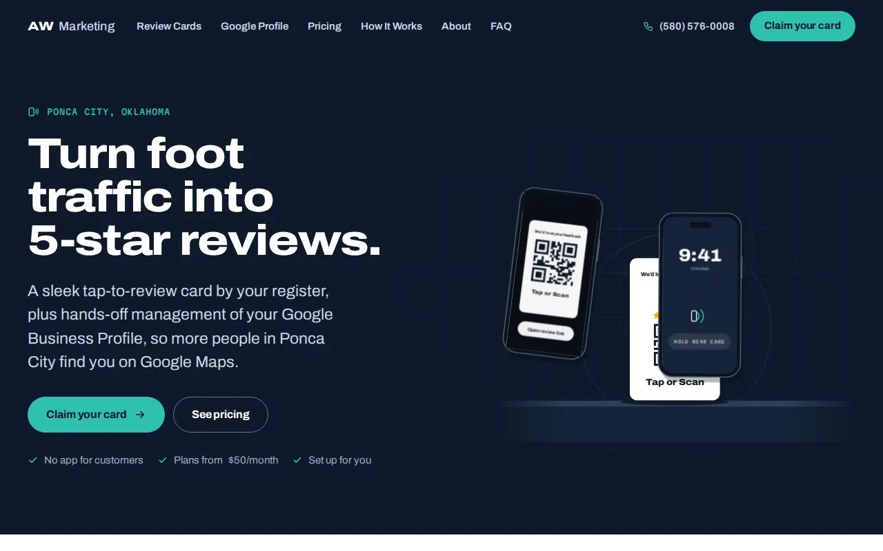
The site, running live
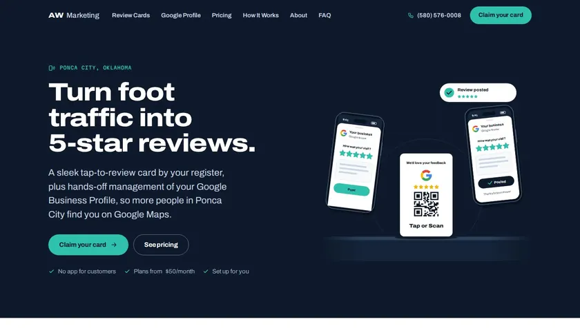
Same site · phone width
That is the real AW Marketing site, served live into this page — scroll it, click it. That is the real AW Marketing site. Open it full-screen and you are looking at exactly what their customers get.
Open it full-screen ↗What was built
The site, piece by piece
9 pages
- Home
- Review Cards
- Google Profile
- Pricing
- How It Works
- About
- FAQ
- Contact
- Privacy
What it does
- Contact form: every inquiry is saved on the server, then emailed to the owner
- Tap-to-call and tap-to-email on every page, with a call bar pinned to the bottom on phones
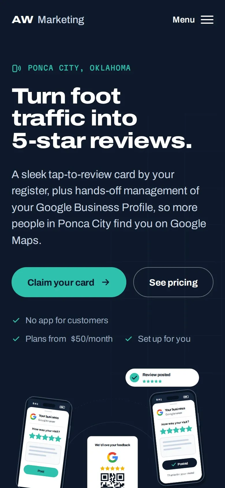
- Mobile-first layout, checked at 360, 390 and 1440 pixels wide
- HTTPS on its own domain; www and http redirect to it
- Every illustration drawn in code, including the animated tap-or-scan demo — no stock photos
Lighthouse, mobile (measured October 4, 2026 on awmarketingok.com · median of 3 runs)
- 92Performance
- 100Accessibility
- 100Best practices
- 100SEO
Performance ranged 91–99 across those runs; it moves with network and server load, so it is shown as measured, not rounded up.
The job
What this site had to do
AW Marketing sells two things to local shops: a tap-to-review card that sits by the register, and monthly care for a business's Google profile. The owners it is selling to are busy, and most will look the site up on a phone at their own counter.
So the site had to explain a physical product without a single photo of it, put both plans side by side without fine print, and turn a visit into a message that actually reaches the owner. It runs on its own domain — open awmarketingok.com yourself.
What the site does for them
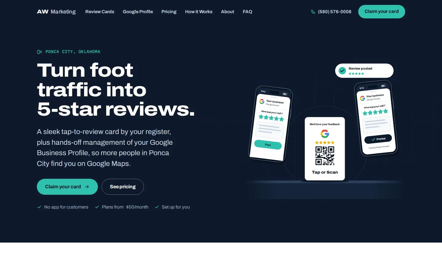
- Shows the card as it is printed, and both ways a customer uses it: tap it, or scan its QR code
- Puts both monthly plans on one page and compares them feature by feature
- Saves every contact-form inquiry first, then emails it to the owner
- Keeps call and email one tap away on every page, with a call bar pinned on phones
The work it lists
NFC tap-to-review cards · Google Business Profile management · Professional review responses · Monthly local Google posts
Design decisions
The choices I made for this one
Every site I build gets decided rather than assembled. These are the calls that make this one AW Marketing's site and nobody else's.
The product is drawn, not photographed
There was no product photo to use, so the card is drawn in code exactly as it is printed — the feedback line, the Google G, five stars, the QR code and "Tap or Scan". The same drawing appears in the hero, the cutaway on the Review Cards page and the share images, so the card always looks like the real one.
Tap or scan, shown side by side
The hero animation plays one phone tapping the card and a second phone scanning its QR code, and both land on the review screen — so an owner sees in a few seconds that the card works for a customer whose phone can't tap. It waits for the first scroll or touch to start, so it costs the page nothing while it loads.
Both plans, compared line by line
Instead of a sales call to find out what is included, the pricing page puts the two plans next to each other as large cards and then compares every feature in one table that still fits a 360-pixel phone without sideways scrolling.
A form that can't lose a lead
The contact form saves each inquiry on the server before anything else happens, and a separate job emails it to the owner, retrying if the send fails. A visitor always gets a thank-you page, and a broken email setting can never throw a lead away.
Yours next
Want one of these for your business?
Tell me what you do and what town you're in. You'll see your site finished, on a live link, before you pay anything.